
The Purest of Styles Excerpt from a Book Review by John Updike
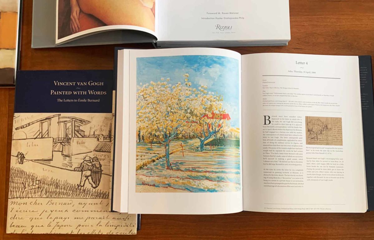
“Van Gogh’s letters to Bernard form a blazing witness to this process, and a true testament — a testament beautifully presented, it should be said, in the catalog, a model volume of scholarship and of book design and manufacture.”
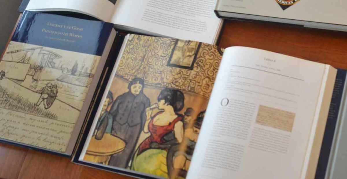
Design: Pirtle Design (Woody Pirtle, Scarlet Duba)
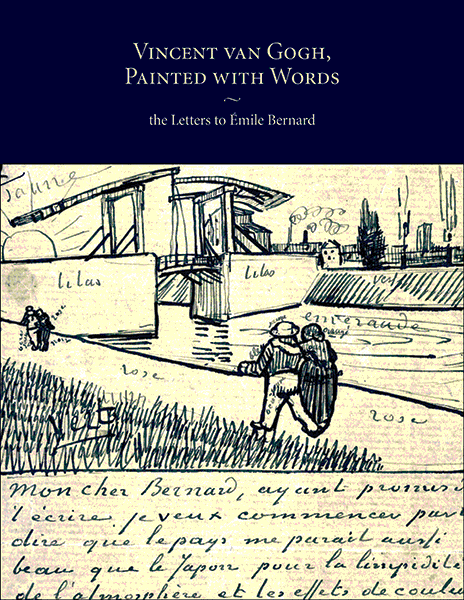
Published by Rizzoli Publications
More about the collection of letters at the Morgan Library Collection >