
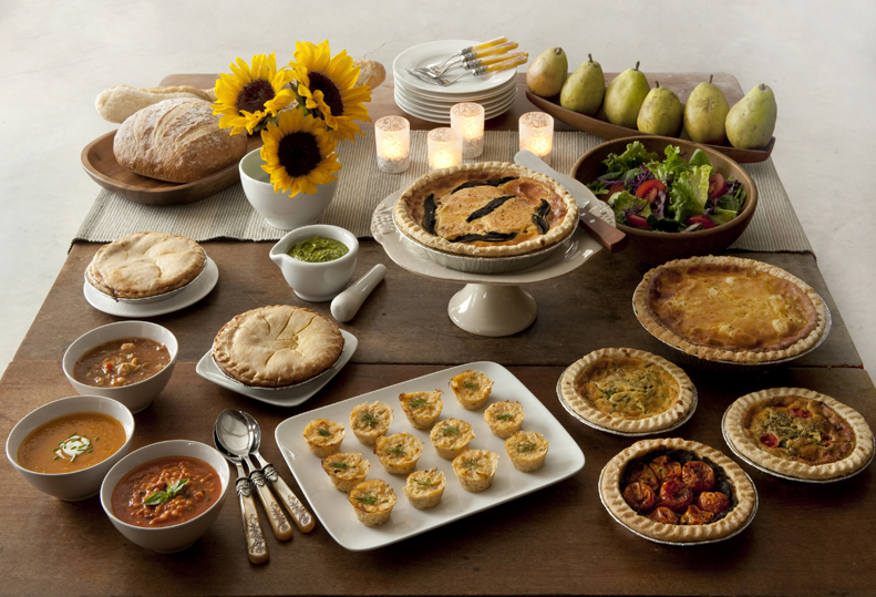
I had the great opportunity to re-design Pika’s Farm Table Logo. Some of you might have tasted their amazing quiches, empandas, or indulged in one of their Liege Style Belgian waffles, fresh from the farm markets of New York.
Since the company is now 10 years old, I give them a lot of credit for taking the jump to re-brand their identity. It’s challenging for the owner to do this, because you want to make sure people still recognize them. At the same time, they needed to elevate the look, throughout their printed materials and packaging design, as their company grows larger.
The logo I designed for them is literally a place setting at Pika’s Table! The plate is represented minimally to keep the focus on the warmth of the Hearth, right in front of you. Home is where the heart is, and also where the food is, in my opinion. The plate setting is a feeling of being home, and being taken care of. At the end of the day, the food is already prepared for you. The clients are inspired by provencial colors—yellows, whites & blues. The hearth flourish (and soon to be secondary typeface) is based off of a chancery from the medieval times, to give one a sense of the “old world foods”, unprocessed, no preservatives, just pure & delicious.
Photography by Jennifer May.