Confectionery Packaging
Presenting a packaging design for Fruition Chocolate’s salted caramels.


Presenting a packaging design for Fruition Chocolate’s salted caramels.


The Kingston Parks and Recreation department has a vision for the city to become a “park-to-park” and “greener city”, a place where people walk and bike to work; a place where people and kids have recreational opportunities and healthy outlets. I felt that watercolors were the best approach so I painted the cover and the inside map with blue (water) and green (parks). Water is a prominent source of recreation throughout Kingston since the city reaches the Hudson River’s edge. Design: Duba Design Printing: 100% Recycled, Chlorine-free Paper using Soy Inks
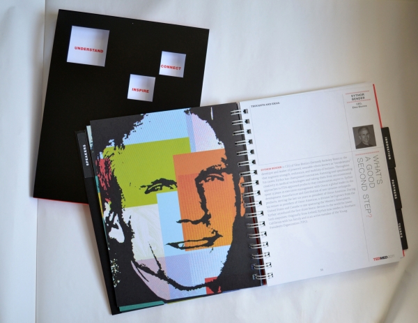
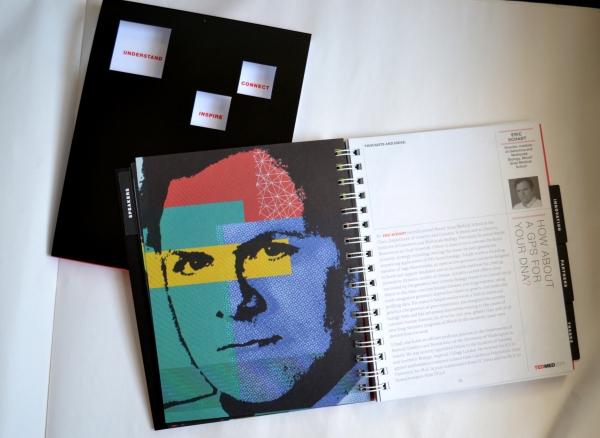
I’ve been traveling to Alexander Isley‘s studio in Connecticut, to work on the TED MED conference program. We designed 50+ unique portraits for each speaker. The design process was very experimental. I photographed black and white portraits on the tv/computer screen to get the moiré pattern effect. Typically this is something photographers try to avoid. But, it allowed each one to be a unique, and the effect added depth and texture to the flat black art. I then added color overlays behind the black and spotted them with white line art for more texture. Portraits recognized in the CADC Excellence Award as the portrait Illustrator for TED MED 2011.
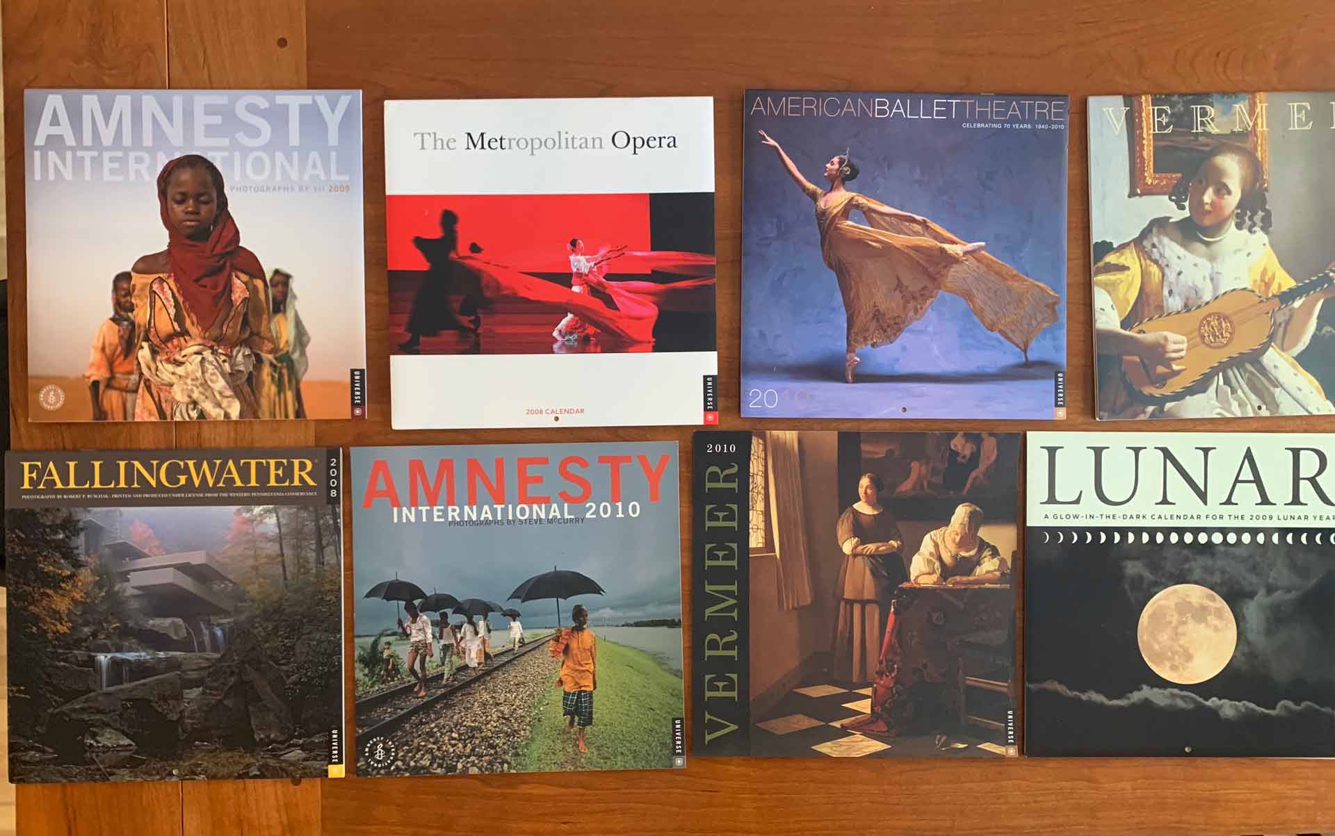
Hard to believe I’ve been designing calendars since 2004! Each year is a new challenge in typography. One of my favorites–a glow-in-the dark lunar calendar with the moon phases!
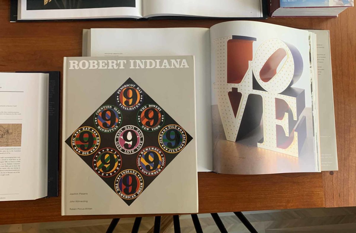
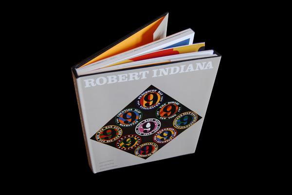
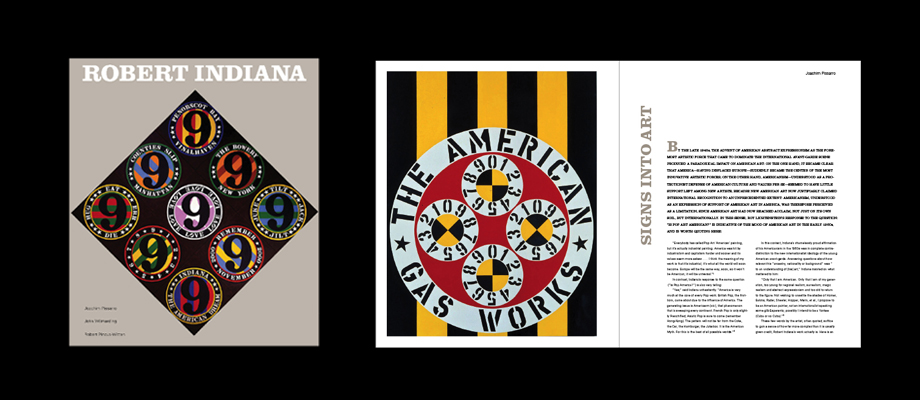
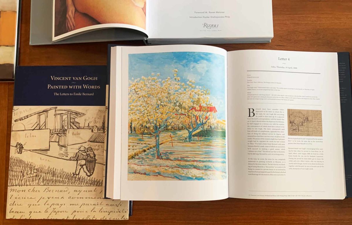
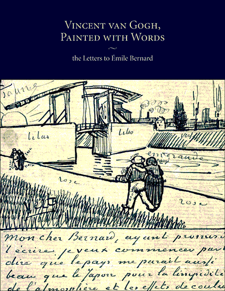
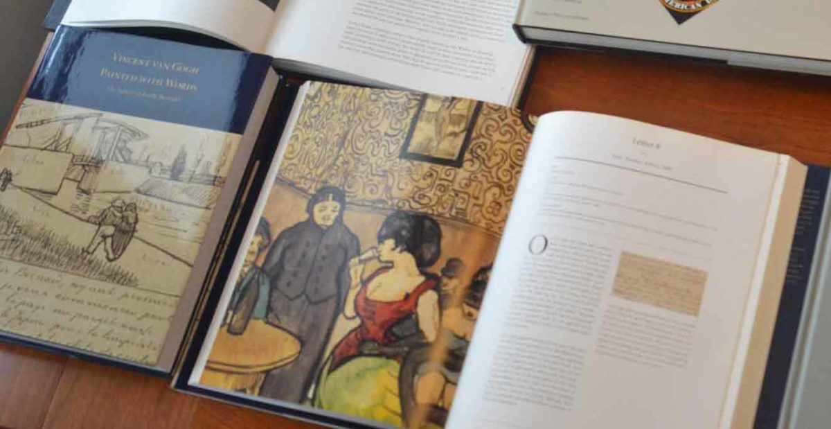
Published by Rizzoli Universe.
Design: Pirtle Design (Woody Pirtle, Scarlet Duba)
Published by Rizzoli Publications
More about the collection of letters at the Morgan Library Collection >


This portfolio book is a showcase of an amazing body of work over the last 10 years by Louise Brooks & Vince Falotico. An Architecture firm in New Caanan, CT. We used a dove gray linen cover with a blind gloss embossed stamp on the cover to give it that subtle & classic edge. Inside pages printed on mohawk’s superfine soft white. There is something sentimental about looking at personal living spaces in print and I think this communicates well to their clientele.
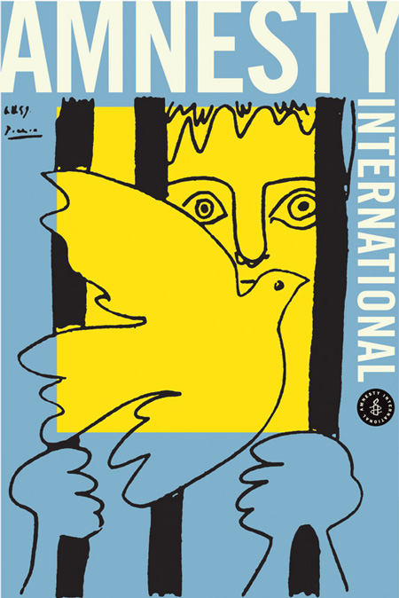
This Poster was selected to be part of the “50 YEARS OF POSTERS FOR AMNESTY INTERNATIONAL 1961–2011”